To wrap up this introduction to Android app development we’ll look at a few more common Android widgets and how to handle their events.
To demonstrate the following examples I’ve started a new Android project called “Widget Playground” with an Empty Activity (and no backward compatibility). Your starting XML code should look something like this:
|
1 2 3 4 5 6 7 8 9 |
<?xml version="1.0" encoding="utf-8"?> <android.support.constraint.ConstraintLayout xmlns:android="http://schemas.android.com/apk/res/android" xmlns:app="http://schemas.android.com/apk/res-auto" xmlns:tools="http://schemas.android.com/tools" android:layout_width="match_parent" android:layout_height="match_parent" tools:context=".MainActivity"> </android.support.constraint.ConstraintLayout> |
CheckBox Widgets
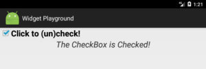
I n 4-4 we learned about the JCheckBox widget. Android supports a similar CheckBox widget. Drag and drop a CheckBox (from the Buttons group) followed by TextView widget onto the layout. Feel free to adjust their visual properties. Your XML layout should now look something like this:
|
1 2 3 4 5 6 7 8 9 10 11 12 13 14 15 16 17 18 19 20 21 22 23 24 25 26 27 28 29 30 31 32 33 |
<?xml version="1.0" encoding="utf-8"?> <android.support.constraint.ConstraintLayout xmlns:android="http://schemas.android.com/apk/res/android" xmlns:app="http://schemas.android.com/apk/res-auto" xmlns:tools="http://schemas.android.com/tools" android:layout_width="match_parent" android:layout_height="match_parent" tools:context=".MainActivity"> <CheckBox android:id="@+id/checkBox" android:layout_width="wrap_content" android:layout_height="wrap_content" android:layout_marginLeft="16dp" android:layout_marginStart="16dp" android:layout_marginTop="16dp" android:checked="true" android:text="Click to (un)check!" android:textSize="24sp" app:layout_constraintStart_toStartOf="parent" app:layout_constraintTop_toTopOf="parent" /> <TextView android:id="@+id/checkBoxStatusView" android:layout_width="wrap_content" android:layout_height="wrap_content" android:layout_marginLeft="59dp" android:layout_marginStart="59dp" android:layout_marginTop="8dp" android:text="The CheckBox is Checked!" android:textSize="24sp" app:layout_constraintStart_toStartOf="parent" app:layout_constraintTop_toBottomOf="@+id/checkBox" /> </android.support.constraint.ConstraintLayout> |
Ensure that the ID property for the CheckBox widget is checkBox (line 10), and use checkBoxStatusView for the TextView widget (line 23). If you don’t do this the Java code that follows will need adjustments. Notice on line 16 that I have set the default status of the checkBox to true, meaning it’s checked.
Now edit the MainActivity.java file. Start by adding the following imports for our two widgets and the OnClickListener interface for the CheckBox. CheckBox event handling works the same way as with Button widgets.
|
1 2 3 4 5 6 7 |
// Import our Widget classes import android.view.View; import android.widget.CheckBox; import android.widget.TextView; // Import Event handling classes for CheckBox widget import android.view.View.OnClickListener; |
Within the MainActivity class, add instance variables for both widgets:
|
1 2 3 |
// Declare reference variables for our widgets private CheckBox checkBox; private TextView checkBoxStatusView; |
Within the onCreate() method, point our widget reference variables to the widget objects.
|
1 2 3 |
// Initialize our widget reference variables checkBox = findViewById(R.id.checkBox); checkBoxStatusView = findViewById(R.id.checkBoxStatusView); |
Create an inner class to implement the onClick() method of the OnClickListener interface:
|
1 2 3 4 5 6 7 8 9 10 11 12 13 |
class CheckBoxListener implements OnClickListener { @Override public void onClick( View v ) { if (v.getId() == R.id.checkBox) { if (checkBox.isChecked()) { checkBoxStatusView.setText("The CheckBox is Checked!"); } else { checkBoxStatusView.setText("The CheckBox is Unchecked."); } } } } |
Notice in the onClick() method that I am verifying that it was our checkBox that was clicked. Since we only have one, this is obviously unnecessary but I’m including it in this example to demonstrate how you could handle more than one CheckBox using the same event listener. The isChecked() method returns true or false depending on the status of the CheckBox widget.
Finally, we need to set the event listener for our checkBox widget. Add the following lines to the end of the onCreate() method:
|
1 2 |
// Set the event listener for our checkBox widget checkBox.setOnClickListener(new CheckBoxListener()); |
That’s all there is to it — try running it!
SeekBar Widgets
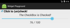
 A SeekBar widget allows a user to specify an integer value by dragging a “thumb” to the right or left.
Add a SeekBar (ID: seekBar) and another TextView (ID: seekBarStatusView) widget to our layout:
|
1 2 3 4 5 6 7 8 9 10 11 12 13 14 15 16 17 18 19 20 21 22 23 |
<SeekBar android:id="@+id/seekBar" android:layout_width="473dp" android:layout_height="61dp" android:layout_marginLeft="64dp" android:layout_marginStart="64dp" android:layout_marginTop="36dp" android:max="100" android:progress="50" app:layout_constraintStart_toStartOf="parent" app:layout_constraintTop_toBottomOf="@+id/checkBoxStatusView" /> <TextView android:id="@+id/seekBarStatusView" android:layout_width="wrap_content" android:layout_height="wrap_content" android:layout_marginLeft="269dp" android:layout_marginStart="269dp" android:layout_marginTop="18dp" android:text="50 / 100" android:textSize="24sp" app:layout_constraintStart_toStartOf="parent" app:layout_constraintTop_toBottomOf="@+id/seekBar" /> |
The SeekBar widget has a max property to specify its maximum integer value, and a progress property to set the initial value of the SeekBar. In this example our seekBar will support an integer range from 0 to 100, and the “thumb” will start in the middle at 50.
Next, add the following imports to our MainActivity.java file:
|
1 2 |
import android.widget.SeekBar; import android.widget.SeekBar.OnSeekBarChangeListener; |
Add instance variables for the new widgets:
|
1 2 |
private SeekBar seekBar; private TextView seekBarStatusView; |
In the onCreate() method add code to initialize the instance variables to refer to the new widgets:
|
1 2 |
seekBar = findViewById(R.id.seekBar); seekBarStatusView = findViewById(R.id.seekBarStatusView); |
To handle SeekBar events we need to implement the OnSeekBarChangeListener interface which requires 3 methods.
|
1 2 3 4 5 6 7 8 9 10 11 12 13 14 15 16 17 18 |
class SeekBarListener implements OnSeekBarChangeListener { @Override public void onProgressChanged(SeekBar seekBar, int progress, boolean fromUser) { seekBarStatusView.setText(progress + " / 100"); } @Override public void onStartTrackingTouch(SeekBar seekBar) { // Called when the user starts changing the SeekBar // Not Used / Implemented } @Override public void onStopTrackingTouch(SeekBar seekBar) { // Called when the user finishes changing the SeekBar // Not Used / Implemented } } |
The onProgressChanged() method is called continuously as the user changes the value of the SeekBar. The progress parameter indicates the current value of the SeekBar. The onStartTrackingTouch() and onStopTrackingTouch() methods are called when the user starts and finishes changing the SeekBar, respectively. In this example, I am not implementing code for these last two methods, but must include them with empty method bodies.
Finally, we need to set the event listener for our seekBar widget. Add the following line to the end of the onCreate() method:
|
1 |
seekBar.setOnSeekBarChangeListener(new SeekBarListener()); |
Although the event listening interface is different, the implementation pattern is pretty similar for most widgets.
Spinner Widgets
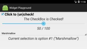
 Android supports a Spinner widget that provides functionality similar to the JComboBox (i.e., drop-down list) in Swing.
Drag and drop a Spinner (ID: spinner) widget (from the Containers group) followed by TextView (ID: spinnerStatusView) widget onto the layout. Your design XML layout should now include the following:
|
1 2 3 4 5 6 7 8 9 10 11 12 13 14 15 16 17 18 19 20 21 |
<Spinner android:id="@+id/spinner" android:layout_width="585dp" android:layout_height="wrap_content" android:layout_marginLeft="8dp" android:layout_marginStart="8dp" android:layout_marginTop="28dp" app:layout_constraintStart_toStartOf="parent" app:layout_constraintTop_toBottomOf="@+id/seekBarStatusView" /> <TextView android:id="@+id/spinnerStatusView" android:layout_width="wrap_content" android:layout_height="wrap_content" android:layout_marginLeft="48dp" android:layout_marginStart="48dp" android:layout_marginTop="28dp" android:text="TextView" android:textSize="24sp" app:layout_constraintStart_toStartOf="parent" app:layout_constraintTop_toBottomOf="@+id/spinner" /> |
To provide the list of options that will appear in the Spinner, we need to define an array of strings in the app > res > values > strings.xml file:
|
1 2 3 4 5 6 7 8 9 |
<resources> <string name="app_name">Widget Playground</string> <string-array name="spinner_options"> <item>Nougat</item> <item>Marshmallow</item> <item>Lollipop</item> <item>KitKat</item> </string-array> </resources> |
The Java code changes are a little more complex than the other widgets we’ve learned so far, but the pattern is similar. Start by importing the following widget classes:
|
1 2 |
import android.widget.Spinner; import android.widget.ArrayAdapter; |
And the following two classes for event handling:
|
1 2 |
import android.widget.AdapterView; import android.widget.AdapterView.OnItemSelectedListener; |
Add the following instance variables for our widgets:
|
1 2 |
private Spinner spinner; private TextView spinnerStatusView; |
And initialize them in the onCreate() method:
|
1 2 |
spinner = findViewById(R.id.spinner); spinnerStatusView = findViewById(R.id.spinnerStatusView); |
Next, we need to instantiate an ArrayAdapter class to link our spinner widget with the spinner_options array we defined earlier. Add the following code to the onCreate() method:
|
1 2 3 4 5 6 |
// Create an ArrayAdapter for our spinner ArrayAdapter<CharSequence> spinnerAdapter = ArrayAdapter.createFromResource(this, R.array.spinner_options, android.R.layout.simple_spinner_item); spinnerAdapter.setDropDownViewResource(android.R.layout.simple_spinner_dropdown_item); // Set the adapter for the spinner spinner.setAdapter(spinnerAdapter); |
Next, create an inner class to implement the onItemSelected() method of the OnItemSelectedListener interface:
|
1 2 3 4 5 6 7 8 9 10 11 |
class SpinnerListener implements OnItemSelectedListener { @Override public void onItemSelected(AdapterView<?> parent, View view, int position, long id) { spinnerStatusView.setText( "Current selection is option #" + position + " (\""+spinner.getSelectedItem()+"\")" ); } @Override public void onNothingSelected(AdapterView<?> parent) { // Not Used / Implemented } } |
You may have noticed the strange <?> generic syntax above. The <?> is a wildcard that means the type of the object is not specified or unknown. This makes it possible to support any Object (or subclass of Object).
Finally, we need to set the event listener for our spinner widget. Add the following line to the end of the onCreate() method:
|
1 |
spinner.setOnItemSelectedListener(new SpinnerListener()); |
WebView Widgets
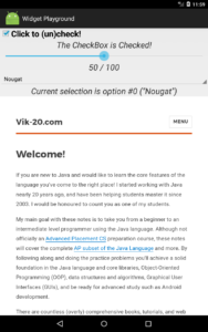
 One last widget! One of the apps I use several times a day is a weather app, but it’s user interface has very few Android widgets. Instead, the app is essentially a viewer for a weather HTML page that includes lovely graphics and JavaScript code to give it interactivity. This means that the content and user interface for the app can be changed on the backend (i.e., web server) easily and at any time without having to update the app on my device. Let’s add a WebView widget to see how this works!
First, we need to permit our app to access the Internet. Add the following line to the app > manifests > AndroidManifest.xml file, just before the <application> tag.
|
1 |
<uses-permission android:name="android.permission.INTERNET"/> |
Next, drag a WebView (ID: webBrowser) widget to our layout.
|
1 2 3 4 5 6 7 8 9 |
<WebView android:id="@+id/webBrowser" android:layout_width="585dp" android:layout_height="458dp" android:layout_marginLeft="8dp" android:layout_marginStart="8dp" android:layout_marginTop="8dp" app:layout_constraintStart_toStartOf="parent" app:layout_constraintTop_toBottomOf="@+id/spinnerStatusView" /> |
Add the following import to our MainActivity.java file:
|
1 |
import android.webkit.WebView; |
Add an instance variable for the new widget:
|
1 |
private WebView webBrowser; |
In the onCreate() method, initialize the reference variable to point to the WebView widget:
|
1 |
webBrowser = findViewById(R.id.webBrowser); |
Finally, configure our webBrowser to support JavaScript and to load URLs into our widget instead of opening the default browser app on the device.
|
1 2 3 4 5 6 7 8 9 10 11 |
// Enable JavaScript for our WebView webBrowser.getSettings().setJavaScriptEnabled(true); // Load URLs in our WebView instead of a separate browser app webBrowser.setWebViewClient(new WebViewClient() { @Override public boolean shouldOverrideUrlLoading(WebView view, WebResourceRequest request) { return super.shouldOverrideUrlLoading(view, request); } }); // Load a URL webBrowser.loadUrl("https://www.vik-20.com"); |
To load a web page into our webBrowser widget:
|
1 2 |
// Load a URL webBrowser.loadUrl("https://www.vik-20.com"); |
You Try!
- Add an ImageButton widget to our WidgetPlayground app. Find and add an image to the res > drawable folder as we did in 5-2. ImageButton widgets use the same OnClickListener interface as Button and CheckBox When the ImageButton is clicked, use the Toast.makeText() method to display an appropriate status message. Note that the first argument to this method call must be MainActivity.this (not just this).
- Add a CheckBox to our TipCalculator app to control whether the final total should be rounded up to the nearest dollar or not.
- Replace the decreaseButton and increaseButton in our TipCalculator app with a SeekBar to control the tip percentage (0% to 20%), start at 15%.