 Wow, that “Hello World!” app was pretty cool, but let’s jazz it up a little. Today we’ll create an improved version from scratch. Along the way you’ll learn more about how to use the Android Studio tools, how to work with component attributes, and how to manage other resources (like images) in our project.
Here’s what our “Hello Again!” app will look like –>
Creating a New Project
Let’s get started!
- Start Android Studio. If your old “Hello World!” project loads automatically, click the File menu, then choose Close Project. You will see the Welcome to Android Studio window.
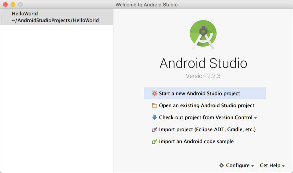 On the left is a history of recently opened project(s). You can reopen a project in this list simply by clicking on it.
 - As you did last time, click Start a new Android Studio project. For the Application name: use “Hello Again!”. Again, choose a location for the project folder that you can access easily. Leave the defaults for everything else and keep clicking Next until you get to the Add an Activity to Mobile screen. This time choose Empty Activity (not Basic Activity) and click Next.
- Important! On the Customize the Activity screen, be sure to uncheck Backwards Compatibility (AppCompat).
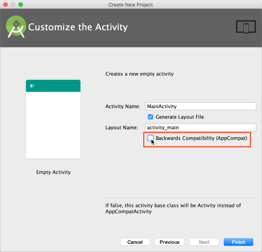 If you leave this option checked, Android Studio will include special libraries to support your app all the way back to Android 2.1 (less than 1% of the Android user base). The trade-off for this backwards compatibility is that your final .apk file would be much bigger than it needs to be, and it would add complexity to the code that we need to write – never a good thing! Be sure to do this for every new project you create.
 - Click Finish and Android Studio will build your new project.
Creating the User Interface
If you look at app > res > layout > activity_main.xml, the user interface will look very similar to our previous app.
The text “Hello World!” is called a TextView widget. If you click on the “Hello World!” text you will see its properties appear on the right in the Properties tool window. Every widget needs to have an ID so that we can refer to it in our code. Below that are the most commonly used properties for the widget such as the text that appears on it, the fontFamily, textSize etc.. To view all possible properties for the widget, click the View all attributes link at the bottom of the Properties tool window.
To start our app completely from scratch, click on the “Hello World!” TextView in the visual editor and press the delete key to remove it.
Editing the Layout
By default, Android Studio organizes widgets using a Constraint Layout. As we will see later, there are other layouts possible, but this one works particularly well with the visual editor and can be used to produce fancy yet efficient user interfaces.
Let’s change the background colour of the layout.
- In the Component Tree tool window (below the Palette tool window), click ConstraintLayout.
- In the Properties tool window you will see the ID, layout_width, and layout_height properties for the layout. Click the View all attributes link at the bottom.
- Here you’ll find dozens of other properties that can be set. Click on the background property, then click on the small paint brush tool icon to the right of it. Android supports standard hex colour codes (#RRGGBB), where each pair of hex digits represents the amount of red, green, and blue, respectively.
- Set the background property to a pale yellow #FFFFEE. This change will immediately appear in the visual editor.
Adding a TextView
Time to add our “Hello Again!” text back.
- From the Palette tool window, drag a TextView widget onto our visual layout to roughly where you’d like it to be positioned.
- After you do this, an error
 icon will appear at the top-right of the visual editor. If you click this icon you will see 1 warning and 1 error. We need to resolve both of these issues.
 - Click the TextView widget in the visual editor (or textView in the Component Tree tool) to reveal its properties. The default ID is textView. It’s good practice to make this name more meaningful. Change it to helloTextView.
- To fix the Missing Constraints error, click the small blue circles (with + signs on them) under the ID attribute we just changed to set the position of our helloTextView relative to the sides of our layout. Click to constrain our helloTextView to the top and left sides of the window (only) for now.
- The text property (i.e., what appears in our helloTextView widget) has a default value of “TextView”. The warning in step 2 above is caused because we are using a hard-coded string here. It is much better design to “externalize” resources (e.g., strings, images, dimensions etc..) so that they can be managed separately from our application code. To do this click the ellipses
 button beside the text property.
 - The Resources window will appear. Click Add new resource, then choose New string Value…
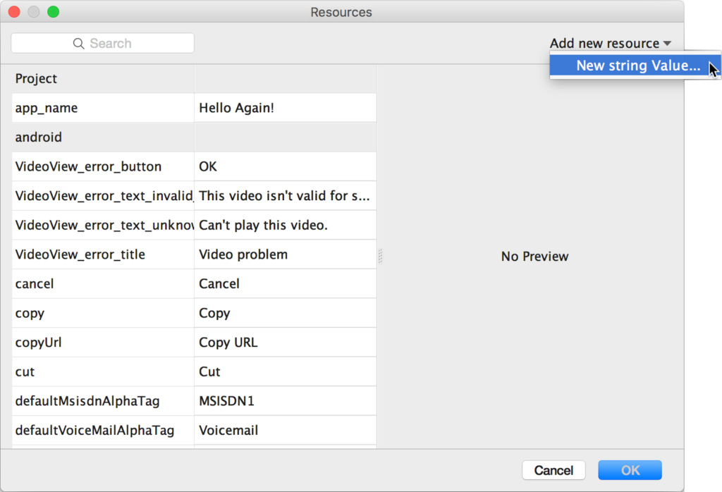
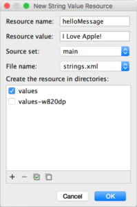 The New String Value Resource window will appear. Set the Resource name: to “helloMessage”, this is the variable name that will be used to access this widget in our Java code. Set the Resource value: to “I Love Apple!”, this is the text that will appear in our helloTextView widget. When you have made these changes, click OK.
Back in the visual editor you will see the effect of the changes we’ve made, and the red warning ![]() icon should be gone.
icon should be gone.
Now it’s your turn to practice! Change the following properties for the helloTextView widget:
- textSize to 36sp
- textColor to #0000FF
- textStyle to Bold
- Layout_Margin[top] to 50dp
- Layout_Margin[left] to 200dp
Awesome! When you are done, the helloTextView widget properties should look like this:
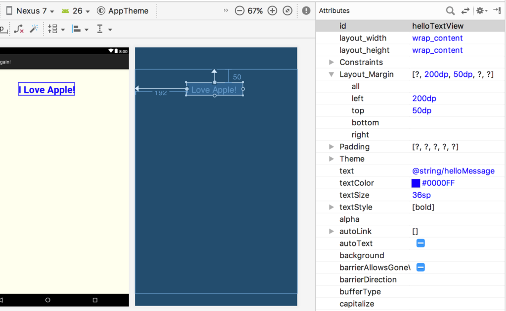
The best way to learn is to experiment, so feel free to play around with more properties if you like. You can always undo (^Z) your changes.
Pixel Measurement Units
Let’s pause for a moment and talk about pixel sizes. In the old days, before mobile devices with very high pixel density displays, developers didn’t have to worry too much about how large a pixel appeared on the screen. Most displays showed ~160 pixels/dots per inch (ppi or dpi). The problem with displays that have very high pixel densities is that text and images of fixed pixel dimensions get scaled down to the point that they are unreadable.
To solve this problem, Android supports two new measurements: dp (density-independent pixel) and sp (scale-independent pixel). One density-independent pixel is equivalent to one pixel on a 160 dpi screen. On a screen with 240 dpi, each density-independent pixel would be scaled by a factor of 1.5 (i.e., 240/160). So, a component that is 100 dp wide, would be scaled up to 150 actual pixels wide so that it looks the same size on the screen regardless of the actual pixel density of the display.
The main difference between dp and sp is that dp is the preferred measure for graphics and layout, while sp is the preferred measure for text/fonts. This is why we used 50dp for our layout_marginTop, but 50sp for our textSize.
Adding an ImageView
Ok, let’s add an image!
- Find an image to add as a resource. I’ve found that .png files tend to work best and support transparency. In the file explorer of your operating system right-click on it and select Copy.
- In the Project tool window, click to select app > res > drawable, then paste (^V) the image.
- The Choose Destination Directory window will appear. Choose the ../app/src/main/res/drawable (not drawable-v24) directory and click OK.
- The Copy window will appear. Here you can rename the image. Note: It’s very important that your image file name contains only lowercase letters (a-z), digits (0-9), or underscore (_) characters or it may not appear properly in your app.
- In the Palette tool window drag an ImageView widget to the visual layout. As you drag (before you release the mouse button) you’ll see light grey alignment lines to help you position the image relative to other components. Try and get it centered in the layout.
- The Resources window will appear again. Click the small triangle to expand the Project resources, then select the image that you added in step 2 and click OK.
- Remember to change the ID for the ImageView widget we’ve added to something more meaningful, like eatingAppleImageView. Also, play around with the layout constraints to get the image roughly centered in they layout.
- Finally, you’ll notice that there is an Image without ‘contentDescription’ warning
 because our eatingAppleImageView does not have a contentDescription attribute set (this is used by screen reading software). To fix this, click the ellipses
  button beside the contentDescription property. In the Resources window that appears, choose the helloMessage string resource we created earlier and click OK. We could also have defined a brand new string resource, but this is good enough for now.
All done! Click the green ![]() Run (^R) button to run the app in the emulator or on a physical device.
Run (^R) button to run the app in the emulator or on a physical device.
At this point you might be wondering: Don’t we have to write any Java code? So far we’ve produced two apps using only the Android Studio tools. There is code underlying both apps, but we have not had to change or write any yet. Once we start adding some user interaction to our apps (next time!) we’ll get into the details of Java coding.
Let’s conclude with a look at some of the key source files that Android Studio generates and maintains for us.
Layout XML Code
Android Studio uses XML to express a GUI’s contents. This allows you, in a human- and computer-readable form, to say which layouts and widgets you wish to use, and to specify their properties. As we were building our app in the graphical editor, Android Studio was busy in the background reflecting all of our changes in the app > res > layout > activity_main.xml file.
To view the actual XML code for our visual design, click the Text tab at the bottom of the Palette tool window. You’ll see the XML for our app interface:
|
1 2 3 4 5 6 7 8 9 10 11 12 13 14 15 16 17 18 19 20 21 22 23 24 25 26 27 28 29 30 31 32 33 34 35 |
<?xml version="1.0" encoding="utf-8"?> <android.support.constraint.ConstraintLayout xmlns:android="http://schemas.android.com/apk/res/android" xmlns:app="http://schemas.android.com/apk/res-auto" xmlns:tools="http://schemas.android.com/tools" android:layout_width="match_parent" android:layout_height="match_parent" android:background="#FFFFEE" tools:context=".MainActivity"> <TextView android:id="@+id/helloTextView" android:layout_width="wrap_content" android:layout_height="wrap_content" android:layout_marginLeft="200dp" android:layout_marginStart="192dp" android:layout_marginTop="50dp" android:text="@string/helloMessage" android:textColor="#0000FF" android:textSize="36sp" android:textStyle="bold" app:layout_constraintStart_toStartOf="parent" app:layout_constraintTop_toTopOf="parent" /> <ImageView android:id="@+id/eatingAppleImageView" android:layout_width="wrap_content" android:layout_height="wrap_content" android:layout_marginLeft="96dp" android:layout_marginStart="96dp" android:layout_marginTop="132dp" android:contentDescription="@string/helloMessage" android:src="@drawable/android_eats_apple" app:layout_constraintStart_toStartOf="parent" app:layout_constraintTop_toBottomOf="@+id/helloTextView" /> </android.support.constraint.ConstraintLayout> |
Each item in the XML corresponds to one of the properties we customized in the layout editor. It’s also possible to directly edit the XML; any changes made would be reflected in the visual editor. Clicking the Design tab will bring you back to the graphical view.
Strings XML Code
You’ll recall that we created a new string resource for our helloTextView widget. Android uses XML to maintain string resources as well. In the Project tool palette, double-click the app > res > values > strings.xml file. You’ll see XML for any strings related to our app:
|
1 2 3 4 |
<resources> <string name="app_name">Hello Again!</string> <string name="helloMessage">I Love Apple!</string> </resources> |
The app_name string is what appears at the top of our app when it’s running. The helloMessage string appears in our helloTextView widget. These strings can be conveniently edited here and any changes will be reflected in our app. The reason it makes sense to externalize string resources like this is that it makes it very easy to create international language versions of an app without having to change any Java code.
Java Code
Finally, in the Project tool palette, double-click the MainActivity.java file in the app > java folder within a package for your app. Here is where you will find the main Java code for the app:
|
1 2 3 4 5 6 7 8 9 10 11 12 13 |
package com.example.vik20.helloagain; import android.app.Activity; import android.os.Bundle; public class MainActivity extends Activity { @Override protected void onCreate(Bundle savedInstanceState) { super.onCreate(savedInstanceState); setContentView(R.layout.activity_main); } } |
If you compare this to the code for our original “Hello World!” app in 5-1, you will find that this code is much simpler. The reason is that we turned off Backwards Compatibility (AppCompat) when we first created the app.
You Try!
- Carefully read and follow the instructions above to build and test your own HelloAgain! app.
- Find three images of celebrities, and create a FaceBook app in which you arrange the images in a collage, each image with a text label identifying the celebrity by name.